Olympic Pictogram
Objective: Create an Olympic symbol using basic geometric shapes that anyone can understand.
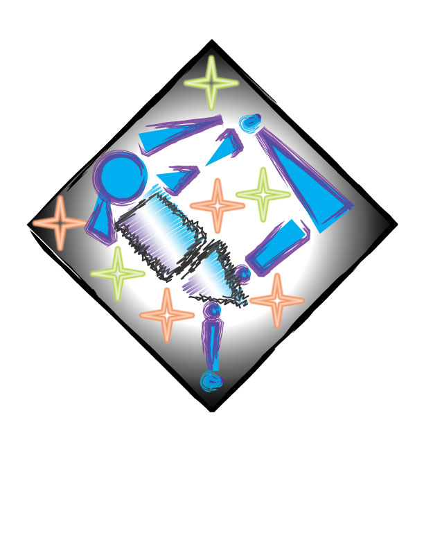
This was our first project using the computer software. We used a vector-based program called Adobe Illustrator. Though it may be hart to see, this is a representation of the Winter Olympic sport of Ice Skating. I honestly think that this would have been a better representation of gymnastics. There are several things I like about this project however. I like the fact that the background draws your attention right to the center of the image, towards the actual skater herself. I also like the fact that it has so many colors and catches your attention right away. I wish that I would have done a better job of representing figure skating through this, and that I had left the border of the skater uniform and not chosen two different styles.
This was our first project using the computer software. We used a vector-based program called Adobe Illustrator. Though it may be hart to see, this is a representation of the Winter Olympic sport of Ice Skating. I honestly think that this would have been a better representation of gymnastics. There are several things I like about this project however. I like the fact that the background draws your attention right to the center of the image, towards the actual skater herself. I also like the fact that it has so many colors and catches your attention right away. I wish that I would have done a better job of representing figure skating through this, and that I had left the border of the skater uniform and not chosen two different styles.
Monogram
Objective: Create a visual representation of the initials in your name.
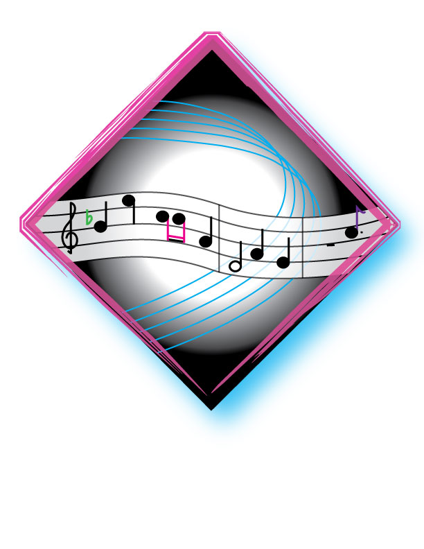
I believe that I did well on this project is well. I liked the fact that I got to represent myself in this picture, but using my initials was a little difficult. There aren't a lot of places that you can find an r, c, b, or h in normal ordinary things. Let alone, my real passion, music. I wish I could have found a way to better represent my initials. This way they don't stand out as much as would be preferred. I also could have made it a little bit busier to draw your attention more. This isn't exactly something you would see in a group of pictures and pick out right away, and that's one of the things I want to happen when I create a graphic like this.
I believe that I did well on this project is well. I liked the fact that I got to represent myself in this picture, but using my initials was a little difficult. There aren't a lot of places that you can find an r, c, b, or h in normal ordinary things. Let alone, my real passion, music. I wish I could have found a way to better represent my initials. This way they don't stand out as much as would be preferred. I also could have made it a little bit busier to draw your attention more. This isn't exactly something you would see in a group of pictures and pick out right away, and that's one of the things I want to happen when I create a graphic like this.
Maze
Objective: Create a maze that a little kid would like and be able to do.
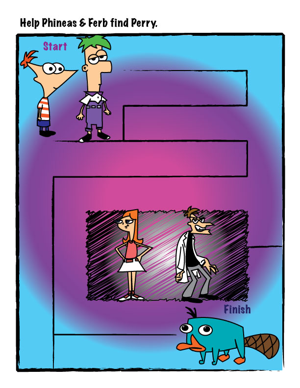
I absolutely love the final result of this project. I love the fact that I was able to use characters that I liked. Yes, I am a little kid at heart. I also think that the graphics I created were well done, no matter how difficult they were. I believe that I did a good job getting all the little details in each of these graphics. The one thing I don't like as much is the way the actual maze it's self was created. I think I could have done a better job in choosing the lines and their placement. I also think I could have picked a better background color. Perry the Platypus blends in with the background blue a little too much.
I absolutely love the final result of this project. I love the fact that I was able to use characters that I liked. Yes, I am a little kid at heart. I also think that the graphics I created were well done, no matter how difficult they were. I believe that I did a good job getting all the little details in each of these graphics. The one thing I don't like as much is the way the actual maze it's self was created. I think I could have done a better job in choosing the lines and their placement. I also think I could have picked a better background color. Perry the Platypus blends in with the background blue a little too much.
Logo Design
Objective: Create a logo for a fictitious company.
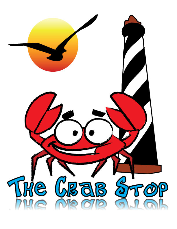
I had some trouble coming up with a company to use. I went through several designs before I finally chose this one, but I am happy with the result. One of my favorite things about this is that it's simple, but at the same time, it is eye catching. It is something you would want to look at, and something that you would, hopefully, remember. My favorite part of this design is the crab and how it stands out the most with its bold outline and is the center of attention. The lighthouse, however, is a little sloppy. It has a few edges that aren't as clean as they should be. You can almost tell that was the last thing that was added to it, and that I just wanted to get this project over and done with.
I had some trouble coming up with a company to use. I went through several designs before I finally chose this one, but I am happy with the result. One of my favorite things about this is that it's simple, but at the same time, it is eye catching. It is something you would want to look at, and something that you would, hopefully, remember. My favorite part of this design is the crab and how it stands out the most with its bold outline and is the center of attention. The lighthouse, however, is a little sloppy. It has a few edges that aren't as clean as they should be. You can almost tell that was the last thing that was added to it, and that I just wanted to get this project over and done with.
Hand-Cut Screen Print.
Objective: Learn the method of hand-cut screen printing.
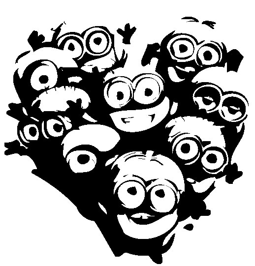
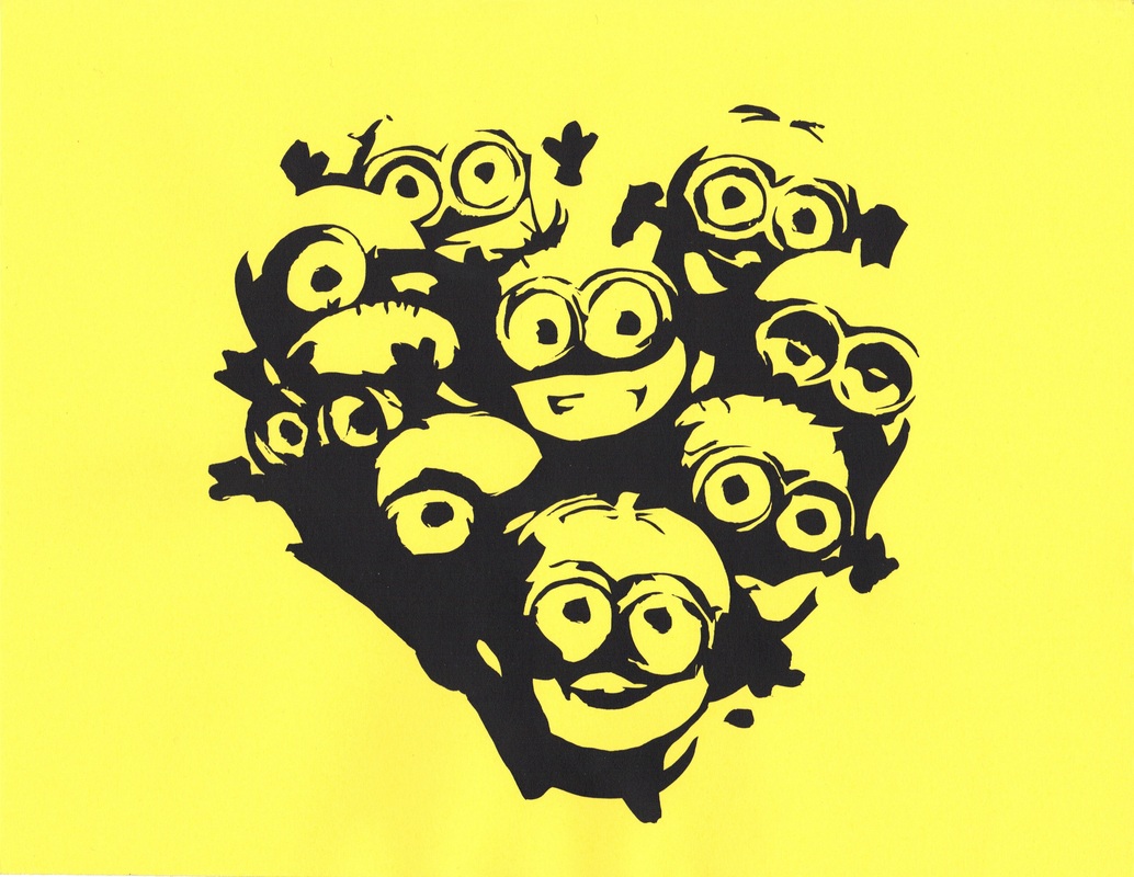
This was our first screen printing project, and our teacher decided to have us do the harder, older version for the first project. Hand-Cut screen printing is where you spend hours cutting out your design with an x-acto knife. It is a very long and time consuming process, but the results are worth it. I thought that it was going to be easier than it was, but, considering how hard it was, I believe that I did a decent job on this project. One of my favorite pats of this project was that I was able to do an image of my choice, something I liked. For those of you who don't recognize them, these are the Despicable Me minions. I like the fact that I didn't completely kill this project, and that the design is visible and relatively close to the original design itself. Despite these things, I am not crazy about the fact that I missed a few of the little details, so there are parts of this image that aren't exactly the way I like. I also don't like the fact that most of the edges are shaky and not clean cut.
This was our first screen printing project, and our teacher decided to have us do the harder, older version for the first project. Hand-Cut screen printing is where you spend hours cutting out your design with an x-acto knife. It is a very long and time consuming process, but the results are worth it. I thought that it was going to be easier than it was, but, considering how hard it was, I believe that I did a decent job on this project. One of my favorite pats of this project was that I was able to do an image of my choice, something I liked. For those of you who don't recognize them, these are the Despicable Me minions. I like the fact that I didn't completely kill this project, and that the design is visible and relatively close to the original design itself. Despite these things, I am not crazy about the fact that I missed a few of the little details, so there are parts of this image that aren't exactly the way I like. I also don't like the fact that most of the edges are shaky and not clean cut.
Direct-Indirect Screen Printing
Objective: Learn how to do the process of direct-indirect screen printing by using an image of yourself.
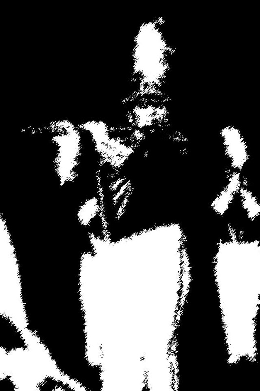
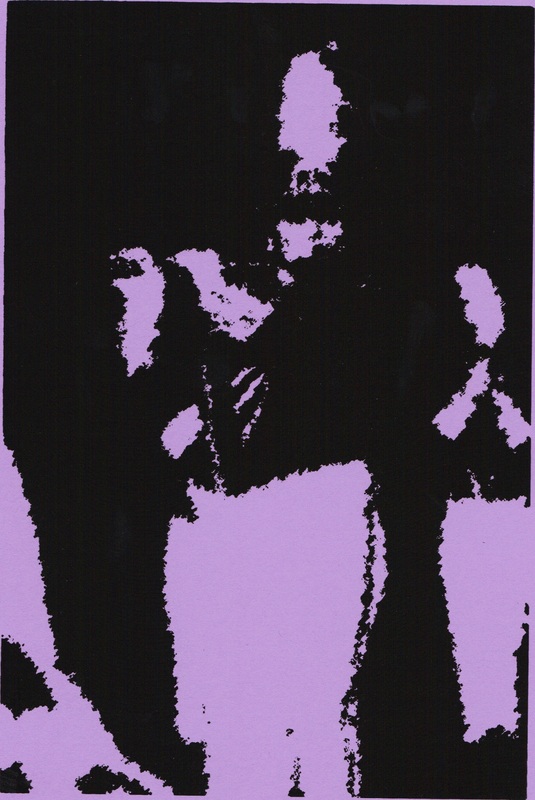
For our second screen printing project, we were allowed to do an easier and less time-consuming method called direct-indirect. This way, you print directly onto clear transparency and then burn that onto your stencil. This method was a lot easier to do than the other one. I love the image and filter I chose. You can see who I am and what defines me in this image. I also like the fact that I did a good job of applying the ink evenly, so there aren't any spots that are darker or lighter than the others. However, you can almost see it from this picture, but I only printed one or two images that were actually straight and centered. I definitely wish I would have done a better job of making sure the screen was secure before printing all of the poorly aligned images.
For our second screen printing project, we were allowed to do an easier and less time-consuming method called direct-indirect. This way, you print directly onto clear transparency and then burn that onto your stencil. This method was a lot easier to do than the other one. I love the image and filter I chose. You can see who I am and what defines me in this image. I also like the fact that I did a good job of applying the ink evenly, so there aren't any spots that are darker or lighter than the others. However, you can almost see it from this picture, but I only printed one or two images that were actually straight and centered. I definitely wish I would have done a better job of making sure the screen was secure before printing all of the poorly aligned images.
T-Shirt
Objective: Design and print a t-shirt of your choice.
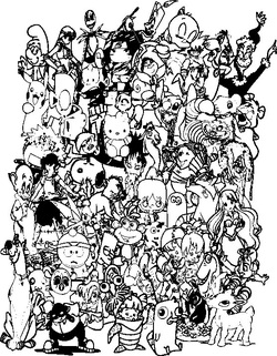
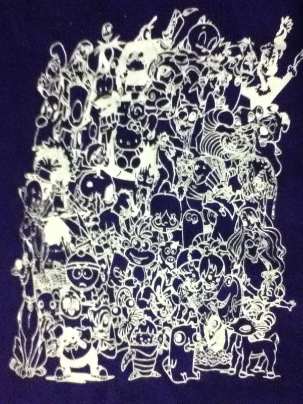
This project was probably one of my favorites to complete in this course. I love the fact that my partner and I didn't take the easy way out of the project and do one simple image like most of the rest of the class, but we took the time to find all of these images and arrange them into the image you see. I absolutely love the final result, even though the image quality of the picture is horrible, so it isn't very clear above. I also like the fact that we got all of our prints to work, so we didn't end up wasting any shirts. However, this image was very detailed, so it was hard to get all of the details to stick to the screen, so there are a few details that didn't show up. Luckily, they just look like they are part of the original image. I also don't like the fact that there are at least two visible pinholes at the top of the design on all of the t-shirts themselves.
This project was probably one of my favorites to complete in this course. I love the fact that my partner and I didn't take the easy way out of the project and do one simple image like most of the rest of the class, but we took the time to find all of these images and arrange them into the image you see. I absolutely love the final result, even though the image quality of the picture is horrible, so it isn't very clear above. I also like the fact that we got all of our prints to work, so we didn't end up wasting any shirts. However, this image was very detailed, so it was hard to get all of the details to stick to the screen, so there are a few details that didn't show up. Luckily, they just look like they are part of the original image. I also don't like the fact that there are at least two visible pinholes at the top of the design on all of the t-shirts themselves.
Notepad
Object: Design a notepad, learn how to develop film and use the offset press.
Developing film involves shooting a negative and putting that negative through a selection of chemicals. Then, you have to strip the negative to block out all of the non-image areas. Then, burn the image to a plate and run the offset press. Running the offset press involves following a million instructions and I'm glad that I was able to follow them all in order come out with a successful project. Cutting this was the dangerous part, and neither I, nor my partner trusted ourselves, but we managed to get it cut. I love the fact that this is a notepad that I will actually use, and this is one of the only projects that is actually able to be used in day-to-day life. I dislike the fact that there is all the extra space around the image; which is a flaw in the designing and not the actual printing.
Developing film involves shooting a negative and putting that negative through a selection of chemicals. Then, you have to strip the negative to block out all of the non-image areas. Then, burn the image to a plate and run the offset press. Running the offset press involves following a million instructions and I'm glad that I was able to follow them all in order come out with a successful project. Cutting this was the dangerous part, and neither I, nor my partner trusted ourselves, but we managed to get it cut. I love the fact that this is a notepad that I will actually use, and this is one of the only projects that is actually able to be used in day-to-day life. I dislike the fact that there is all the extra space around the image; which is a flaw in the designing and not the actual printing.
Event Poster
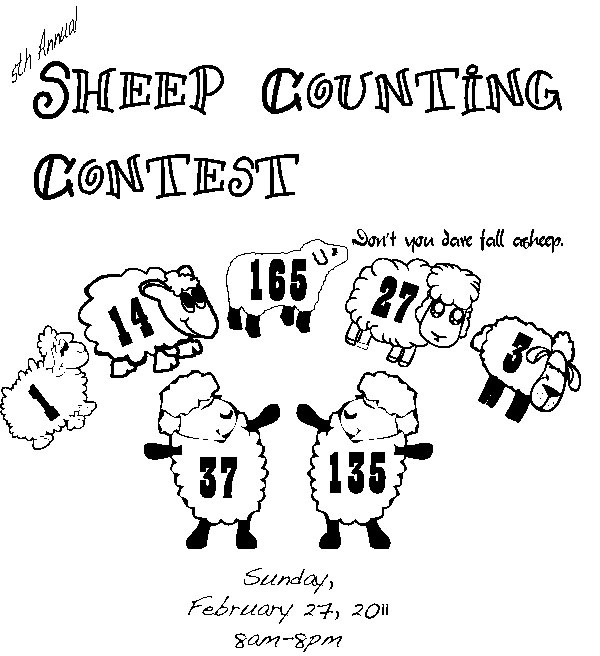
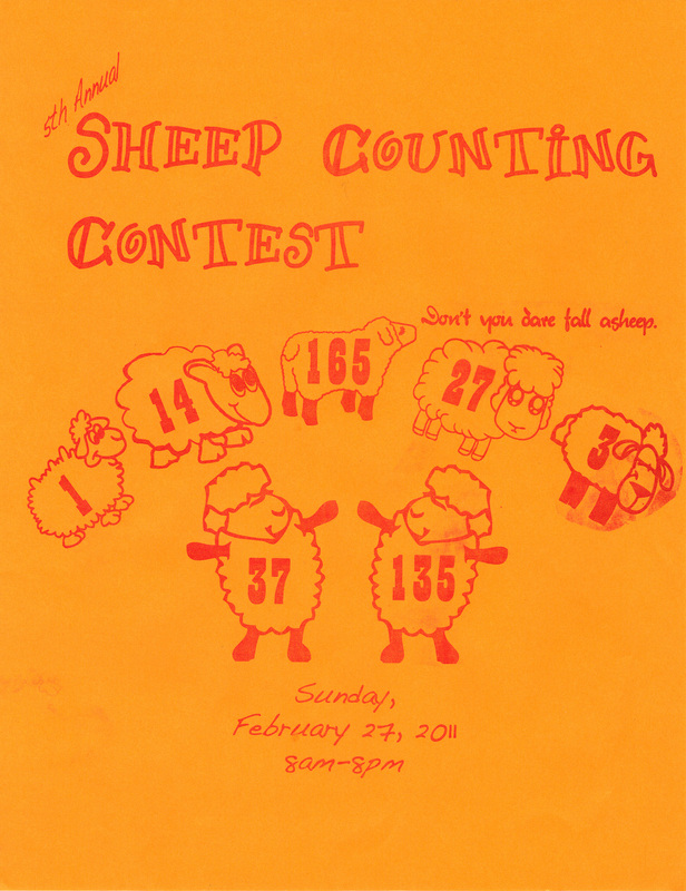
Objective: Design a poster for an event of your choice (fictitious or real) and learn how to work the offset press by yourself.
The steps are basically the same as the ones one the previous offset press project; the only exception is that you did not have a partner to help you complete this. You also didn't have to cut it. I like the overall design of my project, and that I didn't just take a simple image off the internet. Rather, I was able to come up with one of my own. I don't like the fact that the negative wasn't developed right so there is extra ink around the last jumping sheep. I really wish that wasn't there.
The steps are basically the same as the ones one the previous offset press project; the only exception is that you did not have a partner to help you complete this. You also didn't have to cut it. I like the overall design of my project, and that I didn't just take a simple image off the internet. Rather, I was able to come up with one of my own. I don't like the fact that the negative wasn't developed right so there is extra ink around the last jumping sheep. I really wish that wasn't there.
Extras - Tutorials
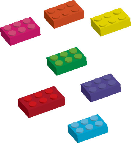
In class we are given time to just do whatever we want. Some of this time is spent working on tutorials or just random projects. I used tutorials to learn how to make bubbles, Lego's, headphones, and the star above Mickey. None of these were very difficult to learn how to make, but that doesn't mean that I could just make them again at the drop of a hat. The images with more than one were basically one copied and pasted to make another one. Then, I changed the color, so it would be more entertaining to look at then one little Lego or one bubble.
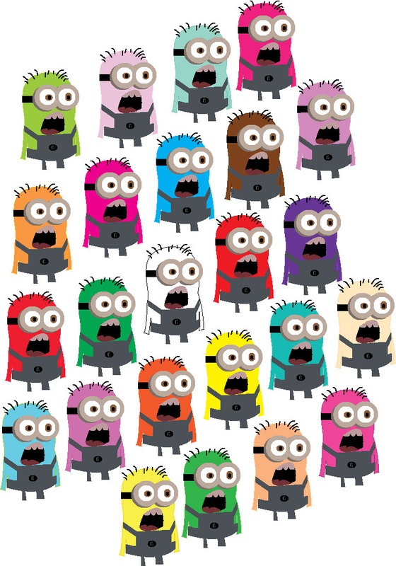
I made the multicolored minions one day when I was trying to find a picture of a purple minion online and was frustrated that I was not able to find one. I decided to make one myself. I'm more than pleased with the results.
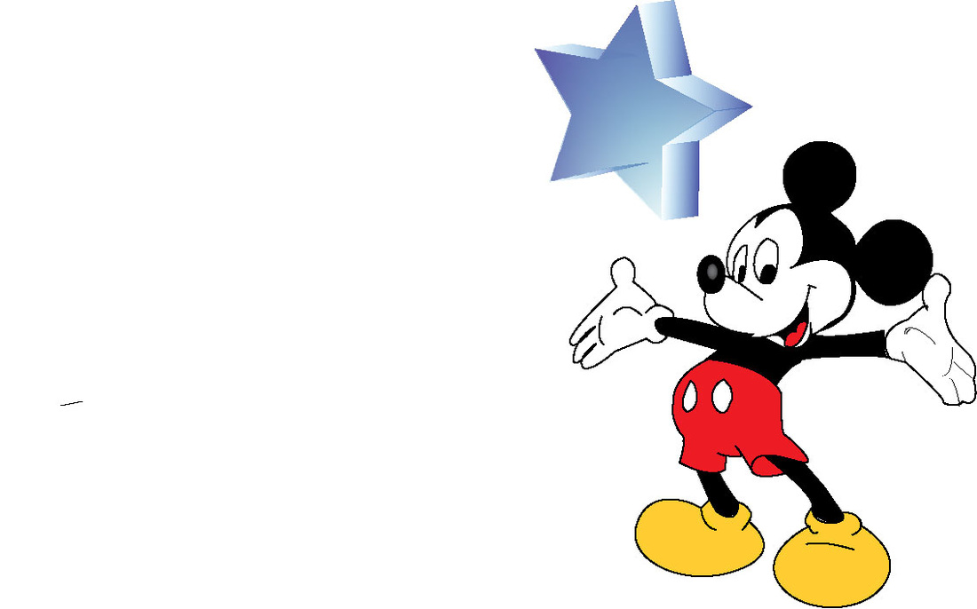
I just made Mickey because I was bored, and he was relatively easy to make. However, I did manage to get all the little details on him, and it doesn't look as much like an image created by a tenth grader. It looks more like a professionally created version. However, I promise you; I made that Mickey all by myself.
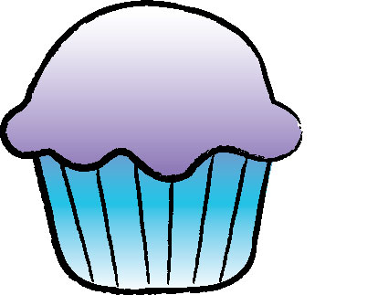
The cupcake was the last thing I ever made in Adobe Illustrator. It was our final day of class, and I had finished my finals early. My friend was making Gir holding a cupcake, so I decided to make my own cupcake.
I made the multicolored minions one day when I was trying to find a picture of a purple minion online and was frustrated that I was not able to find one. I decided to make one myself. I'm more than pleased with the results.
I just made Mickey because I was bored, and he was relatively easy to make. However, I did manage to get all the little details on him, and it doesn't look as much like an image created by a tenth grader. It looks more like a professionally created version. However, I promise you; I made that Mickey all by myself.
The cupcake was the last thing I ever made in Adobe Illustrator. It was our final day of class, and I had finished my finals early. My friend was making Gir holding a cupcake, so I decided to make my own cupcake.
