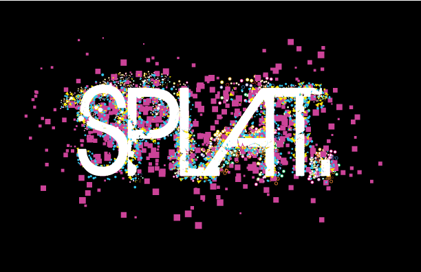
One Line Design
Objective: Create a design using only 2 lines, 3 lines of text, and 3 colors. Include the concepts of "minimalism" and the principles of the Gestalt theory.
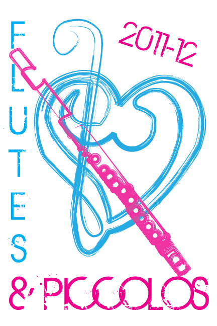
I will admit that when we were given this project, I had no idea what I was going to do. It just so happens that someone around me was talking about band, and I thought about my section. I will also admit I had no idea what I was going to do even after I knew I wanted to do my project on my flutes & piccolos. I knew for certain that I wanted to include a flute somewhere, but I didn't know what I wanted to use my second line for until the day we turned the project in. I thought when I first started working on the computer that I was going to do something else. Little aspects of this just fell together as I worked on it.
My favorite thing about this design has to be the flute. I absolutely love the way that it turned out. I definitely spent the most time on that little aspect. I probably made at least 50 different versions. But the amount of details I added and time I spent making sure every line was straight definitely paid off, because like I said, I LOVE the final result of the flute. The one thing I wish I would have spent a little bit more time on is making sure all of the lines in the heart lined up just right. Some of them are not the best quality. Overall, I am very proud of the final result. I think it's very well done considering I haven't worked in Adobe Illustrator since fall of a year ago.
Covers
Objective: Design a cover for the 2012-13 student handbook to be judged by Graphics I classes and administration.
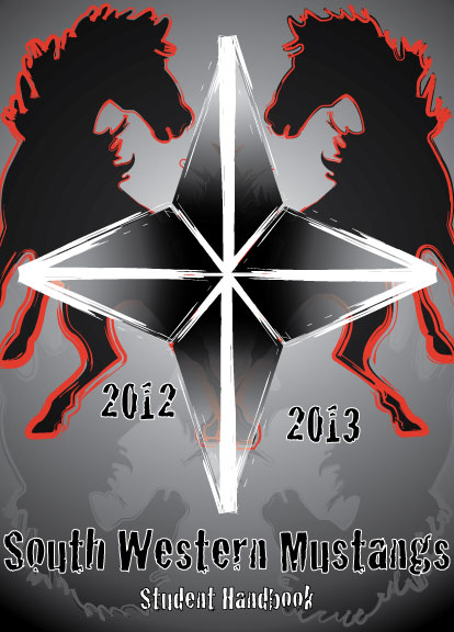
South Western High School is the "Home of the Mustangs." This is why I included 2 mustangs in mine. I also incorporated a compass, because being South West, it's another thing that just "goes" with our school. I chose the colors black, white, and red, because they're our school colors. We were required to have "south western," "student handbook," and 2012-2013 somewhere within the design.
My favorite thing about this project is probably the mustang shadows. I love the fact that they're there without really being there. It's one of those things you kind of miss at first, but then when you go back and really look at it, it makes a cool effect. I think my least favorite thing about this project is the compass. I don't like the way the colors turned out. I think that there was a better way I could have done it. Overall though, I like this project, I wouldn't say that I LOVE it, but there is something there.
Infographic
Objective: Create an infographic related to a school matter.
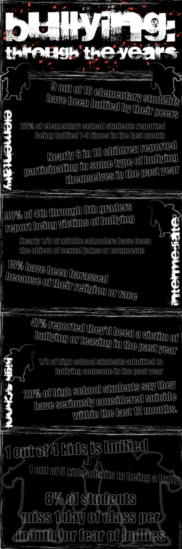
This is the first time this project was ever completed in the class, so we really had nothing to base it on. The project guidelines were created by an independent study student in our class, so our teacher sent us to her with all of our questions. I chose to do mine on bullying. It took me a little bit of time (and some quality time spent with Google) to figure out what I wanted to do it on within the realm of bullying. I ended up doing "Bullying: Through the Years."
My favorite part of this project is the overall layout of the thing. I love the way the bullies and texts just line up. It works. I also like the statistics I went with to put on. They really show you the issues with bullying. It starts young and doesn't stop. I wish I would have included some college or even working place statistics, because bullying doesn't just end after high school, it follows you all throughout your life. It doesn't just magically stop when you leave high school. Overall, I really do love this project. Bullying is an issue, and it's time we do something about it.
Event Poster
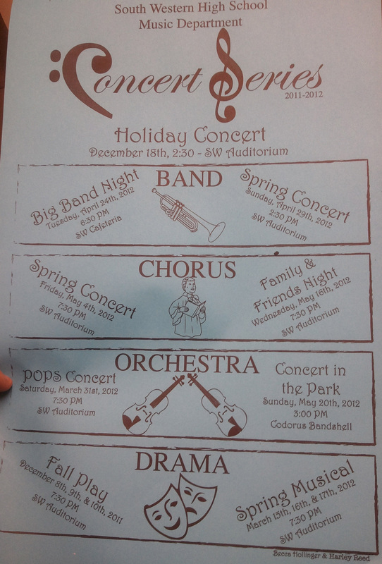
Objective: Design a poster for a school event.
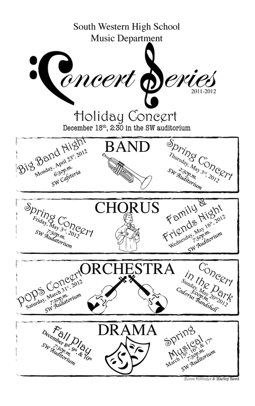
For most previous classes, they all did posters for a winter sport. However, because of the size of our class we had extra projects added for specific teachers within the school. Ours was for our music department. We were to design a poster for the 2011-2012 Concert Series. It took us a little bit to figure out what we really wanted to do, but once we did, we locked in and knocked it out. We had to print this on the off-set press using 2 colors (registration marks).
We did encounter a few problems with spelling both before we did the actual printing, and after the entire project was complete. We ended up having to reprint the entire thing, which is not really that great of an adventure. I do like the overall design of the project however, and I love the way everything came together in the end to get a nice product. I do not however like that the final result was only printed in one color because we messed up the first set. I am glad that the person we were doing the design for liked it and didn't want to burn it.
Magazine Cover & Contents
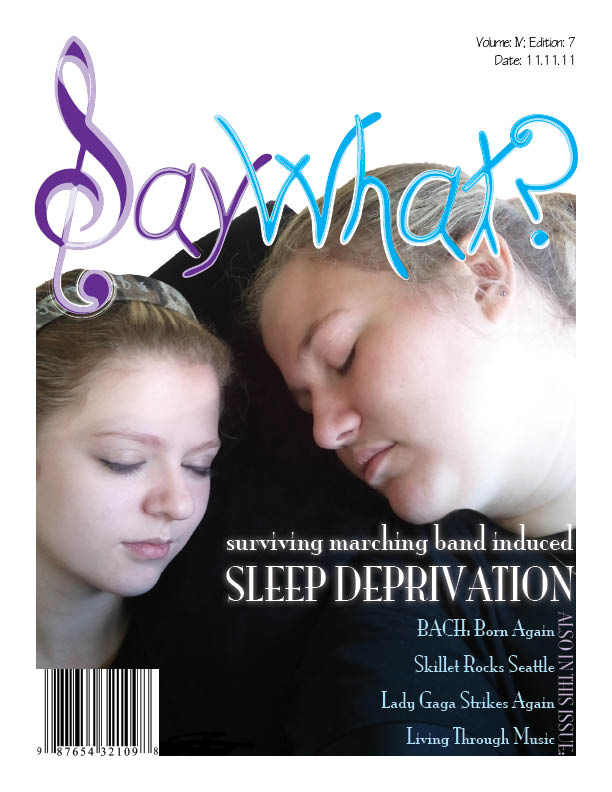
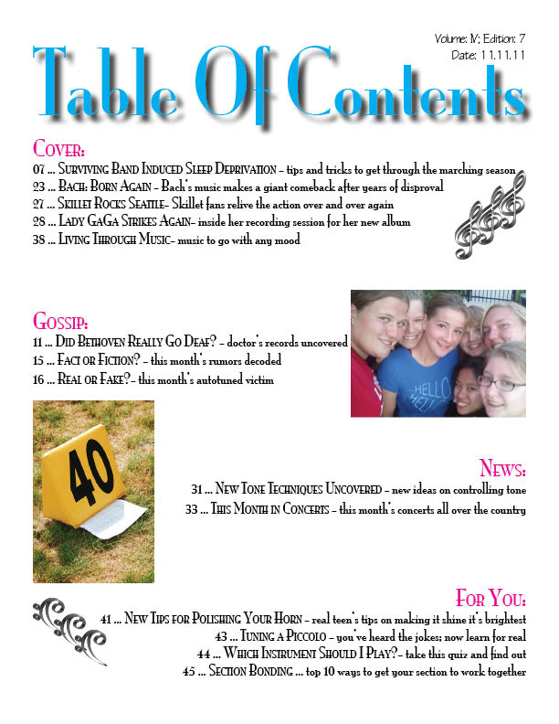
Objective: Design a Magazine Cover and Table of Contents for an original magazine.
For this assignment, we were given two options of what we wanted to do. I can't tell you exactly why I chose this one, but I did. I like that I got to be extremely creative in coming up with ever aspect of this project. I chose to do a "music gossip" magazine, because I like music and could come up with a "catchy" title. Creating the Table of Contents proved to be a more difficult task than I anticipated. I had to look to "real life" magazine table of contents to get an idea for what I should do. It was hard to incorporate everything that was wanted, but in the end, I somehow managed to.
The thing I like most about this project is definitely the cover. I liked that I got to use a picture of my best friend and I; as well as the fact that I was able to get everything to just "fit" together in the end. I don't really like the final result for the table of contents. It looks a lot like it was done, rushed. I wish I would have spent more time working on it to get it looking the exact way that I wanted.
3 Colored Posterization
Objective: Design and screen print a three colored posterization to learn the process of registration and exactitude.
For this assignment, we were assigned a partner to make a three colored posterization that would be screen printed onto five shirts. My partner took the lead in designing the image because to be honest, I had no preference. We then screen printed onto a total of seven shirts using three screens and proper registration. It took us longer than the semester to do this project because of absence.
Overall, I like the end result of this project. I think that we did a good job on screen printing it. I think that there are a couple of spots where ink got that shouldn't have, but we aren't professionals. Our alignment was fairly decent, but again, we aren't professionals. With our abilities, it was an decent execution overall.
Digital Colorization
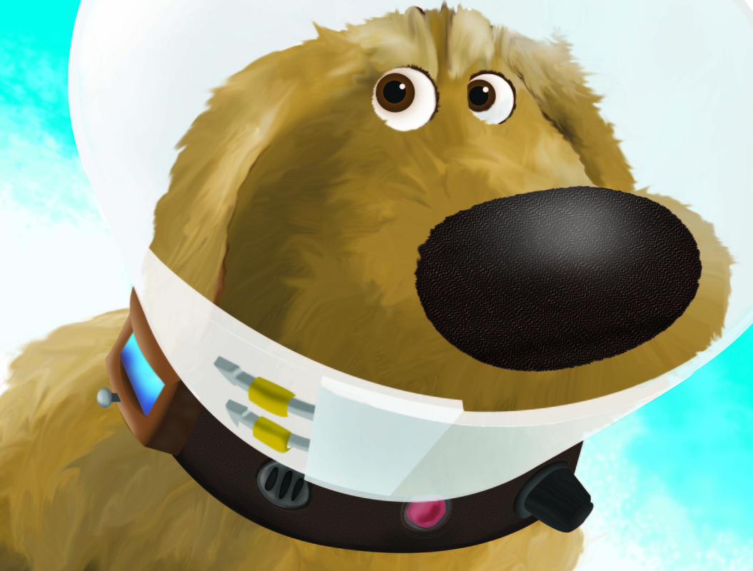
Objective: Recreate an image using a traced image and Adobe Photoshop.
When first assigned this project, it appeared to be a really daunting project. I will admit that I was not extremely excited to have to complete it. However, when I found the image I wanted to work with, I ended up enjoying it a lot more than I ever thought I was going to. This was not an easy project, and it took a great deal of time to fully understand how to work Photoshop. Again, once I did, it proved to be an enjoyable project. It was very entertaining to work with the new software, even if it was only just touching the surface.
Overall, I am very proud of the end result of this project. I think my favorite part is the fur and collar. I very much like the overall texture of them. I also am very happy that I was able to complete the project with the time restraint I was put on. I don’t like that parts of this project appear to be rushed. There were a couple parts that were; I just wish that they didn't look the part.
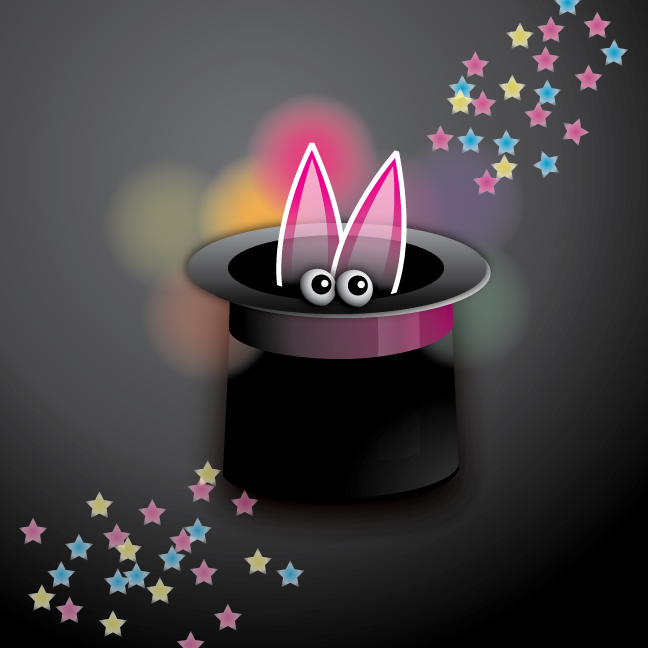
Extras - Tutorials